

Restaurant Color Psychology & Bar Designs
What we observe will influence how we think, and what we think influences what we do. Pretty profound, right? When Chris Kofitsas is designing a restaurant or bar, he mentions you should take your patron’s thoughts into consideration. How do you want them to feel and think? What kind of ambiance are you trying to create? How will elements like color give your restaurant or bar an aesthetic boost? Color is one of the most important factors when building out the schematics for your design. When it comes to picking the best colors for a restaurant, they should never be an arbitrary choice. It’s something that will require much planning since it’s a big factor for livening up the atmosphere in your establishment.
As a highly publicized luxury design firm in NYC, New World Design Builders has collaborated with many businesses to execute stellar design projects. No matter how big or small, color is not something we will forsake when revamping your business aesthetics. Today, we’d like to discuss the psychology of color for restaurant and bar designs.

Restaurant Color Psychology: The Basic Six-Color Wheel
The basic six-color wheel is made up of primary and secondary colors, and can be divided into thirds based on their stimulating functions. The rundown on these color ranges are as follows:
- Strong Stimulants: Yellow, Orange, and Red
- Mild Stimulant: Green
- Suppressant: Purple and Blue
When working with our luxury design firm in NYC, you are more than welcome to combine primary and secondary colors. Having this diversity will yield complementary hues. But let’s not get ahead of ourselves, just yet. Before you decide on a color palette for your restaurant or bar, it’s important to consider the psychology of each shade.
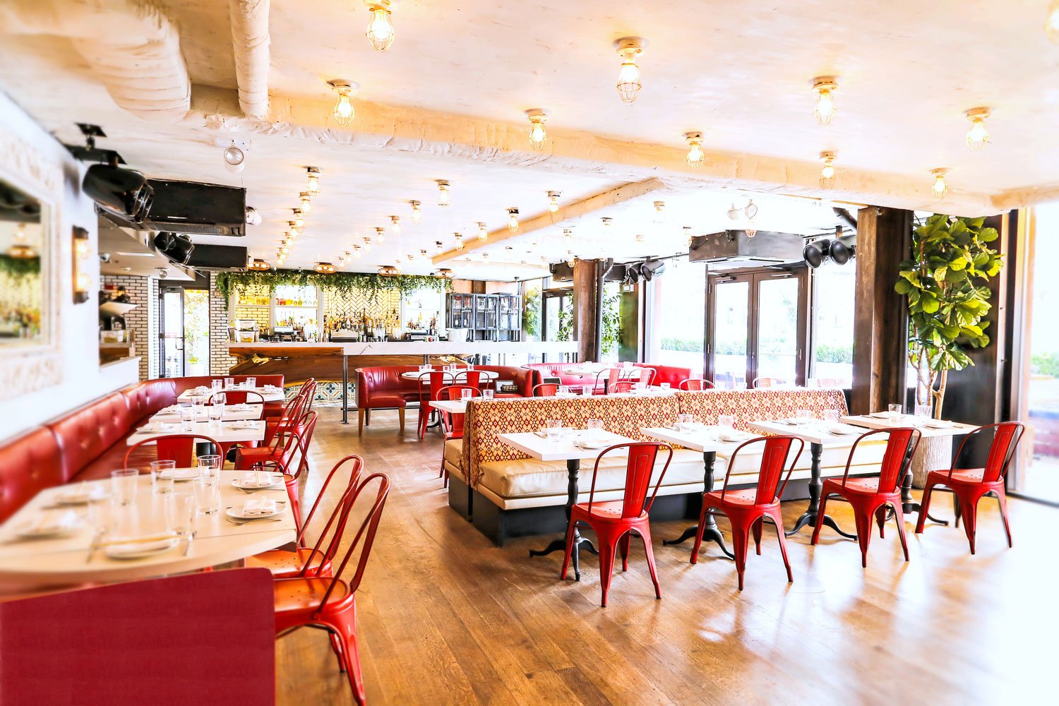
Restaurant Color Psychology: Red
Apart from food and beverage spots, we all associate red with other memories and experiences we’ve accumulated throughout our lives. Red is associated with strength, energy, power, passion, desire, and love. Unless you’ve been living under a rock, you’re probably aware that many fast food restaurants use this color pretty frequently (think Mcdonald’s, Wendy’s, Chick-fil-A). Why is red such a coveted color? Simply put, it’s effective at grabbing attention and inducing feelings of speed and efficiency.
For those designing with the color red, the hue is very significant. The brighter the red, the easier it is to stimulate conversation and raise your heart rate. Conversely, when the shade of red is deep and dull, it’s likely to exude more passion and power. Whichever shade you choose doesn’t matter, a physical and mental reaction will still come about. Fast food companies may use this color pretty frequently, but that’s not to say that it can’t be used in your luxury space. Red can be a force multiplier, especially when it’s paired with complementary pigments. Coordinate with our luxury design firm in NYC for more clarification on how to make this work.
Restaurant Color Psychology: Pink
A color that embodies the fundamental qualities of femininity and romance, pink is typically associated with tenderness, vulnerability, youth, innocence, and a gentle type of love. While it’s used heavily for feminine brands and movements, this isn’t always the case. Our luxury design firm in NYC will take advantage of using pink since it lends itself to soothing environments. On the other hand, if your business isn’t aiming for complete tranquility, that is fine too. Brighter shades of pink can definitely be more stimulating.
Restaurant Color Psychology: Yellow & Orange
From a psychological standpoint, both yellow and orange work harmoniously to reflect energy, increased mental activity, creativity, and the feelings of being comfortable and happy. Just like red, consumers will see yellow and orange dispersed in many popular eateries that desire a quick turnaround. Other neutral forms of yellow and orange such as beige, can give a more earthy effect, which can be useful for organic or natural brands (if this is what you’re seeking in your bar or restaurant).
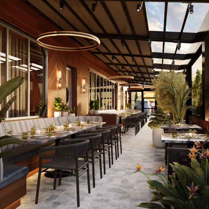
Restaurant Color Psychology: Green
For many people, green represents new beginnings and rejuvenation. It channels many redeeming elements such as growth, harmony, fertility, and freshness. Due to its close ties to the environment, green is utilized for brands that are actively pursuing clients that prioritize their health and wellness above all else. Green is also linked to good flavor! So if your cuisine satiates many patrons consistently, adding green can continue to amplify your business. In terms of choosing a shade, lighter green is great if you are trying to highlight the natural features of a menu, whereas darker green tends to be more conservative and masculine in nature.
Restaurant Color Psychology: Blue
Did you know that blue is a suppressant? It’s best used in drinking environments vs. dining environments, as it evokes feelings of thirst. Blue can also be used with food to emphasize its freshness. Seafood and nautical-inspired restaurants will opt for a blue palette for this reason. To make blue function at a high capacity, it needs to be paired with a lot of neutrals like beige, brown, or white.
Restaurant Color Psychology: Purple
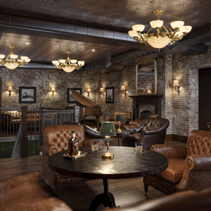
Purple is elegant in every sense of the word. The purple colors for restaurants are tied to royalty, power, luxury, mystery, imagination, and ambition. The reason purple is seen as such a royal color is because of its impact during ancient times. Purple was not often found in nature. A dye needed to be created to achieve this color, but the resources to make it were not always easy to come by. While it’s not a color that is abundantly used in restaurants and bars, it can be used in small quantities to give your restaurant a breath of luxury.
Restaurant Color Psychology: Black
Another color that is regarded as mysterious, black radiates feelings of elegance and power. A heavy concentration of the color can create an environment of simplicity, sophistication and boldness. When used on a smaller scale, black can have a grounding effect because of its heaviness.

Exploring Restaurant Color Psychology With New World Design Builders
Restaurant color psychology is pivotal to success in this highly competitive space. New World Design Builders would be happy to formulate a plan with your business. To learn more about our luxury design firm in NYC, contact us online or give us a call at 212.216.9783